Create Circular Gauge Chart
Create Gauge Chart: This video contains how to create create circular gauge chart in dashboard in OPNBI.
- This document is all about how to create or use Circular Gauge Chart in OPNBI. A circular Gauge Chart is a representation of a device with a radial axis that goes to any angle from 0 to 360 degrees & a pointer indicates the value on that scale. Circular Gauge charts are useful for comparing the values between a small number of variables by using needles on the gauge.
- Use Case: How to create Circular Gauge Chart.
- Prerequisite: Sales.ds
log in to the OPNBI application with your credentials.
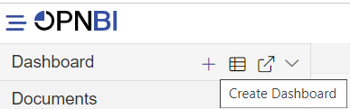
Go to the hamburger menu > click on dashboard > click on ‘+’ to create a new dashboard as shown below:
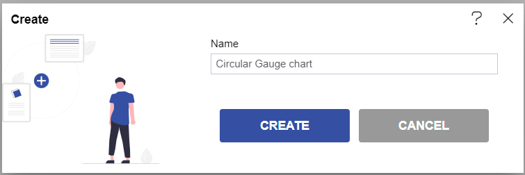
Write dashboard name in the blank box & click on create button after entering the dashboard name in the dialog box. As shown in the below image.
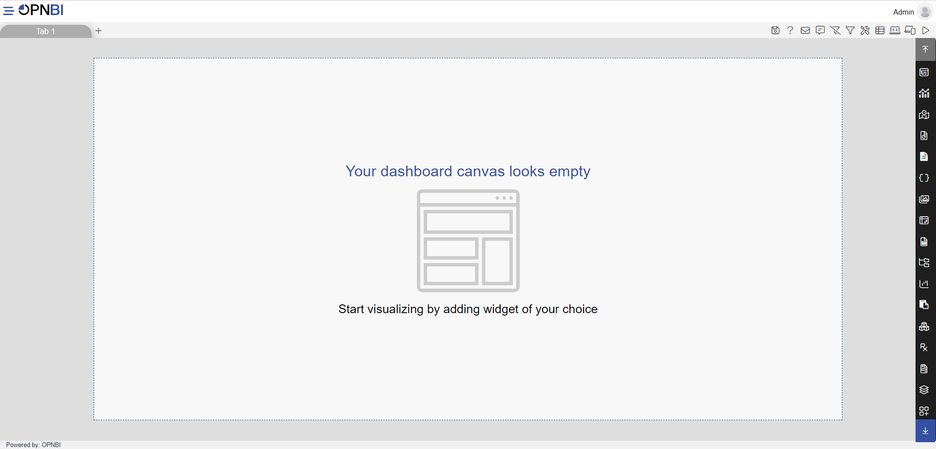
User can able to see the blank screen as given below:
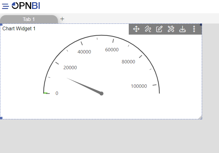
From the right vertical menu, select the Chart widget icon & in other charts select Circular Gauge Chart as shown in the image below:
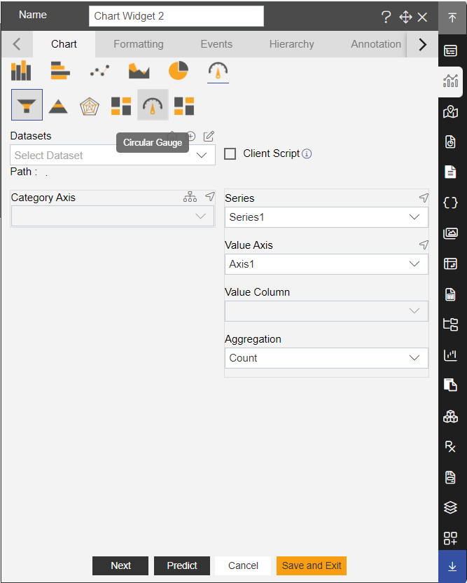
Enter the below details in the edit menu of the chart:
- Dataset: Sales.ds
- Target: quantityOrdered
- Aggregation: Sum
- Actual Value: extendedPrice
- Aggregation: Max
Click on Preview & Save and Exit button. Your screen will look as per below:
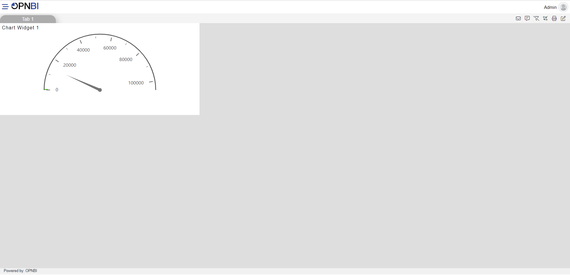
Click on the Preview icon from the top right corner of the dashboard as shown below:
Then the screen of the user will look as per the image below:
In order to understand in detail about other features, click on the following links:-